“3 Things You Must Get Right When Replacing A Sky In Photoshop”
Especially if you want the finished image to be believable
Hey, Steve here.
Swapping and replacing skies in your photos can be great fun, and a really useful exercise for a couple of reasons.
Firstly, it's great practice for honing your Photoshop skills, learning how to edit and adjust light and colour in your landscapes so that you can really put them to great use on your “main” images.
And secondly, it can help you transform dull and boring shots into something much nicer to look at – which at the end of the day is all most of us want, to have nice-looking photos, right?
There's nothing worse than when you go to so much effort to shoot a location (whether it was a one-off opportunity when on your travels, or even just something more local when your valuable photography-time is so limited) – only for the weather conditions to ruin it in one way or another.
So here are what I consider to be the three most important things you need to get right when replacing a sky in Photoshop.
Number 1 – Match the light and contrast between the sky and foreground
When you import a dramatic sky into another image, the new sky is probably going to be either darker or brighter than the sky you're replacing.
So you'll need to take care to adjust the sky (and/or the foreground) so that the brightness ratio between the sky and the foreground still makes sense.
Also, if the sky is taken from a shot which you've already processed in photoshop, it's probably going to contain much more contrast than the shot you're pasting it into.
Take this original image for example.
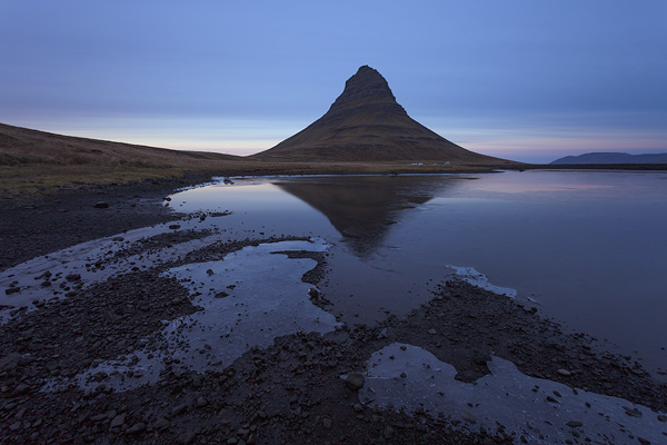
The contrast is quite flat across the image and the sky is very plain.
I decided to replace the sky with a much more colourful and dramatic sky from another shot.
However, the new sky was much darker in comparison, which upset the balance of brightness between the sky and the foreground.
Especially the mountain in the centre of the shot, which to remain realistic needs to be more silhouetted against the sky.
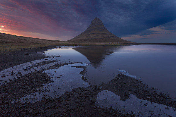
The newly-imported sky is too dark in comparison to the mountain when first pasted into the shot. The mountain doesn't need to be completely dark, but it does need to remain silhouetted to some degree so that the image can retain it's realism.
Now before I show you the corrected version, let's talk about the second most important thing in this whole process…
Number 2 – Match the colours across the sky and foreground
(This isn't number two in order of importance – both of these tips are equally important as each other)
As well as matching the brightness between the sky and foreground, the colour balance between them needs to also match.
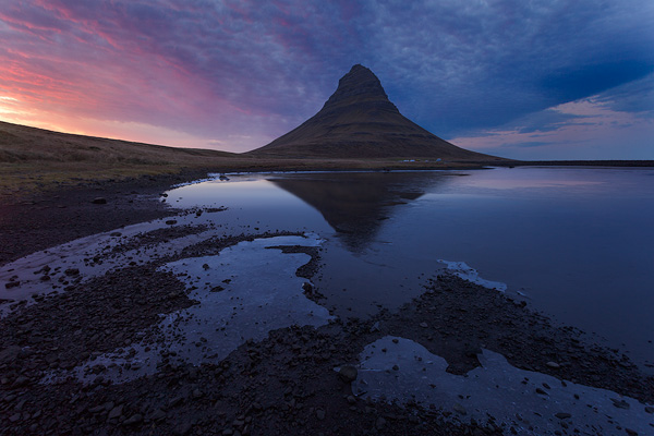
In the image above, the foreground has more of a blue tint compared to the warmer and more colourful sky.
So it is also very important to work on either the foreground, the sky, or both, so that the colour balance matches across the whole image and where necessary, the colours in the sky are reflected correctly in the foreground.
Here's what this image looks like with the exposure and the colour adjusted to create a more realistic blend:
The sky has been brightened slightly and the foreground has been darkened. Also, the foreground colour has been adjusted to better match the colours in the sky.
The blend now looks much more natural in terms of the brightness and the colours across the foreground and the new sky.
Number 3 – Match the direction of the light in the sky to the foreground
The third most important thing to make sure of when replacing a sky is that you match the direction of the light between your sky and foreground.
It isn't always necessary because it depends on the images that you're working with.
But in this example, the sky I've used is clearly brighter on the left side than the right because that's where the sun was.
The light in the foreground image however was very flat with little directional light because the sun was diffused behind the thick cloud.
So it's important that you consider this throughout the rest of your workflow and highlight objects in your foreground (dodging and burning, amongst other techniques etc) so that they appear to be lit from the same light source as the sky.
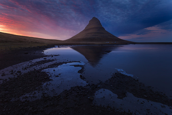
Here in the finished image, the foreground (including the mountain) has been processed to give the appearance of being lit from the same direction as the sky.
Practice practice practice!
Keep these three tips in mind when you're blending skies into new images to give yourself the best chance of creating some really convincing results.
But not only that – If your regular processing workflow (even when you're not replacing skies) involves using layers and masks to edit different parts of your images separately, then these “rules” are going to help you make sure you don't inadvertently mess something up… For example, make foreground objects too bright, or the wrong colour etc…
So what's next?
The example images I've shown you in this article are actually taken straight out of one of the videos you can find in my brand new Creative Colour Compositing Class.
So if you want to see the exact step by step process and the individual techniques I used to create this image (and more) so that you can see the difference they'll make when you use them on your own images, then you can pick up your copy of these new videos from this THURSDAY.