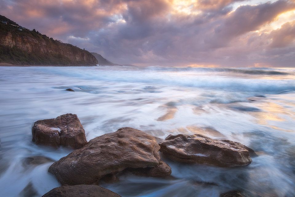
Here's an image that is a classic example of how adding the right amount of contrast in just the right places around the image can make it pop.
On this rather gloomy morning, there was a bit of colour in the sky to play with but the RAW files came out really flat and dull.
No particular object or area within the frame really drew any focus because the overall image contrast was just so low.
Therefore my main goal when processing it was to create a result that complemented the composition I'd framed in camera.
Here's how I did it:
First I added detail and contrast in the rocks to make them stand out against the smooth, lighter water. This created a solid visual anchor in the foreground.
Then I boosted the contrast in the water in just the right places to give it a glossy look and feel. This helps draw attention and connect the foreground and background.
The third objective was to increase the contrast and colour in the sky to give it a lot more definition and make it a point of interest in the background.
These edits were all made during stages 4 and 5 of my 6 stage workflow, which are the stages that allow you to really exercise your creativity.
If you want to go deeper and learn the techniques you need to process your images this way, I cover all of it in detail in my Luminosity Masking Mastery course.
The course is about much more than just the luminosity masking technique itself, also running you through my entire workflow from start to finish.
Click here now to learn more so you can start mastering this way of processing today.
Talk soon,
Steve


